
Cognora Advisory · Brand identity
FinalThe Aperture, Garnet and Gold

01 The idea
Intelligence, observing intelligence.
Every organisation is full of thinking: decisions, data, systems, people. Most of it points in different directions. Cognora brings it to one clear centre, so leaders can see how their organisation really thinks before they change it.
The identity shows this rather than saying it. The first o of the name opens into an aperture, with a second ring of rays turning inside the first: the organisation, looking at itself. At the corner of the name, a bracket marks the vantage point.
02 The mark
The Aperture.
An aperture is the opening that lets light in and decides what a lens can see. Here it takes the place of the o, so the mark is part of the name rather than set beside it.

- The outer raysThe organisation at work: many lines of activity, all pointing to the same place.
- The inner raysA second ring inside the first, slightly turned. The organisation’s view of itself.
- The open centreClarity. The one place every line points to, left open on purpose.
- The bracketSolid garnet, at the top of the name beyond the a. The vantage point, from where the whole can be seen.
03 Construction
Set in the name.
The name is set in Newsreader Semibold at its display size. The aperture takes the place of the first o: 1.10 times the height of the o, centred on it, with a small space either side. The bracket sits level with the top of the C, its arm on the edge of the a, one unit beyond it. ADVISORY is set in Inter capitals and ends exactly on the a.
04 The logo
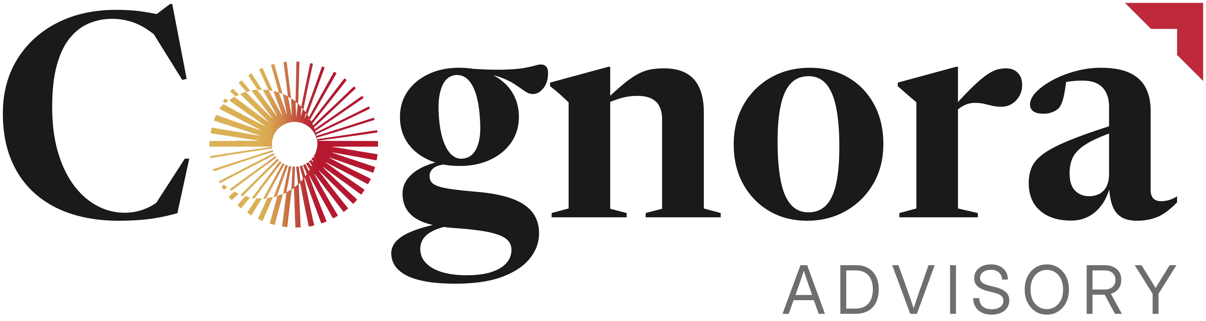
Name, aperture, bracket, descriptor.
On light grounds the name is Ink; on Ink it turns white and the garnets step up so they keep their weight. The aperture is always used exactly as drawn, at every size.
05 The symbol
The C and the bracket.
The C from the name with the bracket, drawn at the logo’s proportions. It stands for Cognora where the full logo cannot be read: profile pictures, browser tabs, app icons and the corner of a post. Everywhere else, the full logo is used.


06 Colour
Garnet and Gold.
Gold sweeps into garnet across the aperture and holds there. The bracket is solid garnet. Everything else is Ink, Graphite, Mist and White. Print values are set on a press proof with the printer.
- HEX
- #DCB155
- RGB
- 220 177 85
- Role
- Start of the sweep
- HEX
- #BF293C
- RGB
- 191 41 60
- Role
- End of the sweep, the bracket
- HEX
- #1A1A1A
- RGB
- 26 26 26
- Role
- The name, text, dark grounds
- HEX
- #6E6E6E
- RGB
- 110 110 110
- Role
- The descriptor, supporting text
- HEX
- #F3F1EC
- RGB
- 243 241 236
- Role
- Light grounds
- HEX
- #FFFFFF
- RGB
- 255 255 255
- Role
- Paper, screen
- HEX
- #D3374B
- RGB
- 211 55 75
- Role
- The bracket on Ink
- HEX
- #E13F4F
- RGB
- 225 63 79
- Role
- End of the sweep on Ink
In use: mostly White, Mist and Ink. Garnet and gold live in the aperture and the bracket, and garnet marks one word or link on a page.
Where the category sits
We reviewed thirty advisory and consulting brands. Fourteen lead with blue and eight with black. The five reds are bright corporate tones. A warm sweep from gold into a deep garnet sits in open space.
07 Grounds
On White, Mist and Ink, and in one colour.
The logo and the symbol sit on White, Mist or Ink only. Never on garnet, gold or a busy image. One-colour versions cover foil, embroidery, etching and blind deboss.


08 Typography
Newsreader and Inter.
Clarity before change.
The face of the name. Newsreader carries headlines, quotes and figures, set large and close. A serif with the calm authority of a well-made report.
We help organisations understand themselves.
The face of the descriptor. Inter carries text, labels and navigation: clear at every size, on paper and on screen.
Both are published under the SIL Open Font Licence: free for print, web and video, with no per-seat cost.
09 In the world
Where Cognora will be met.
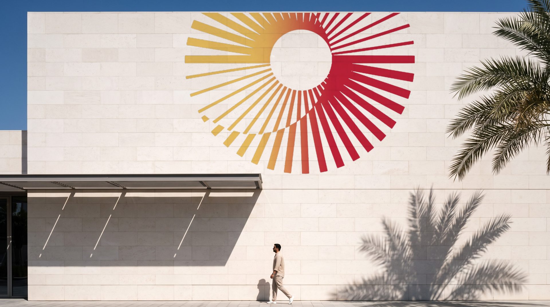
Twelve places the identity will be seen first. The aperture does the large work, cropped and carried by light; the logo and the symbol do the small work.
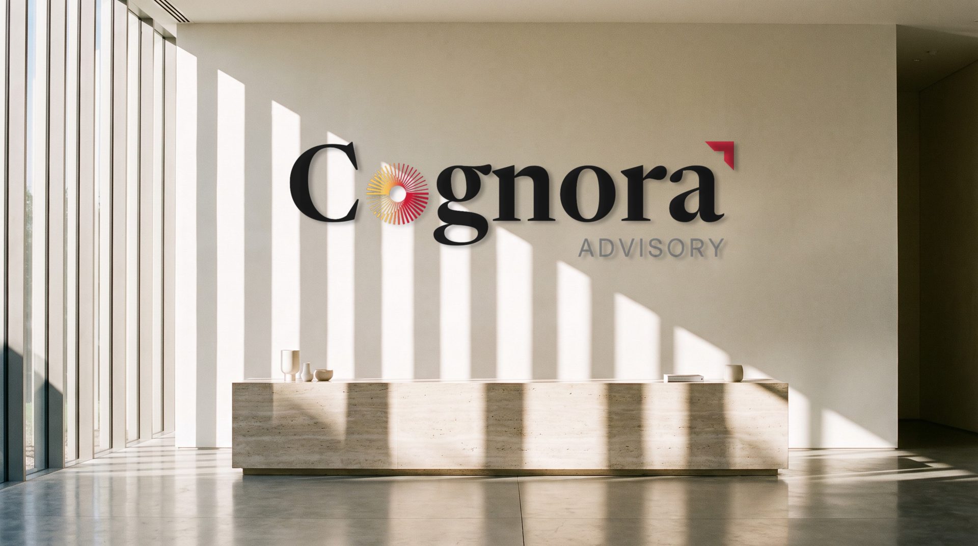
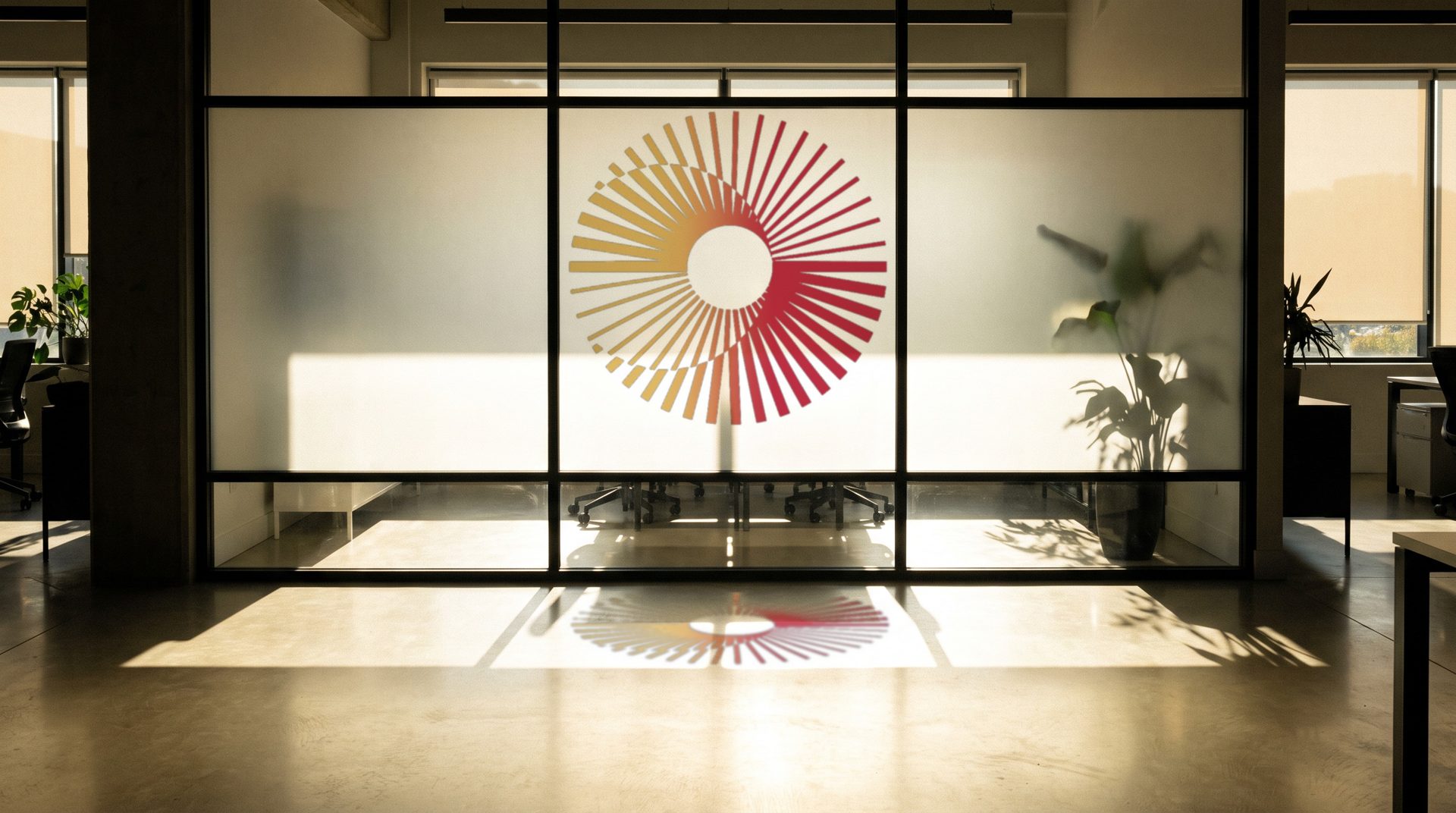
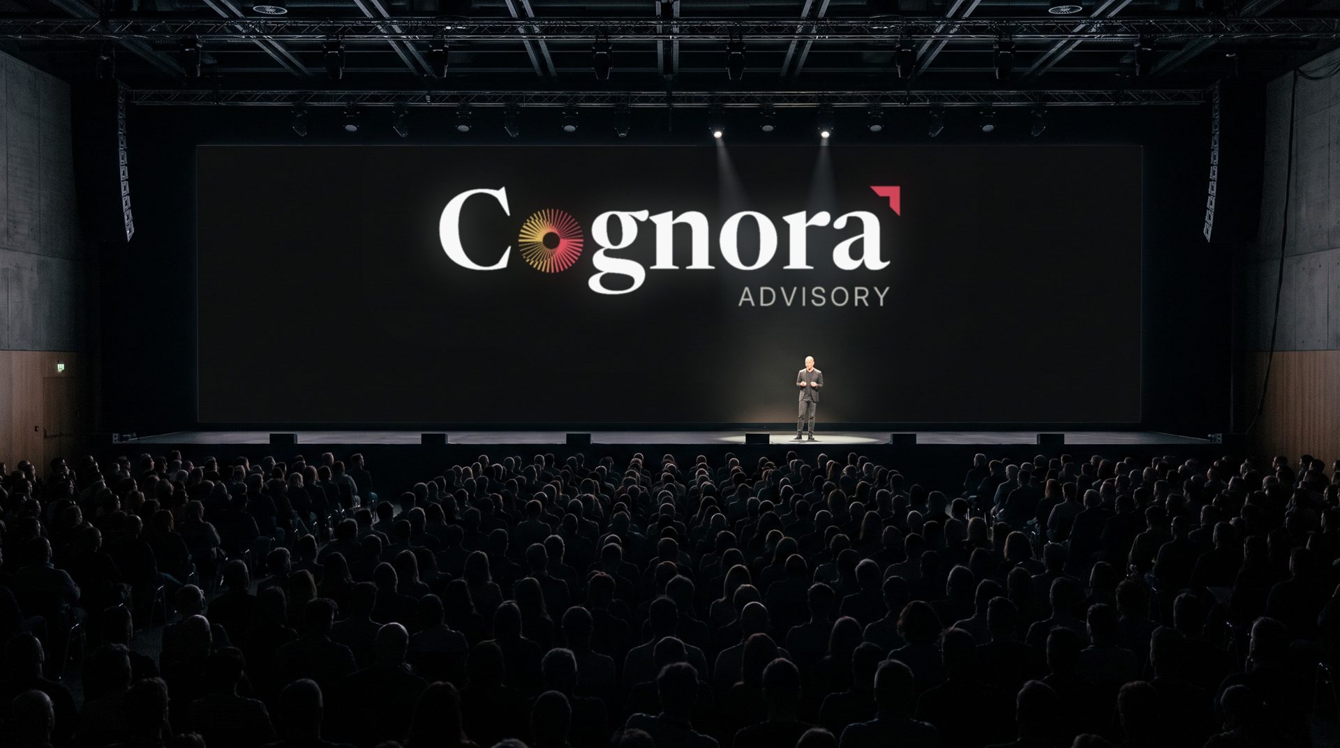
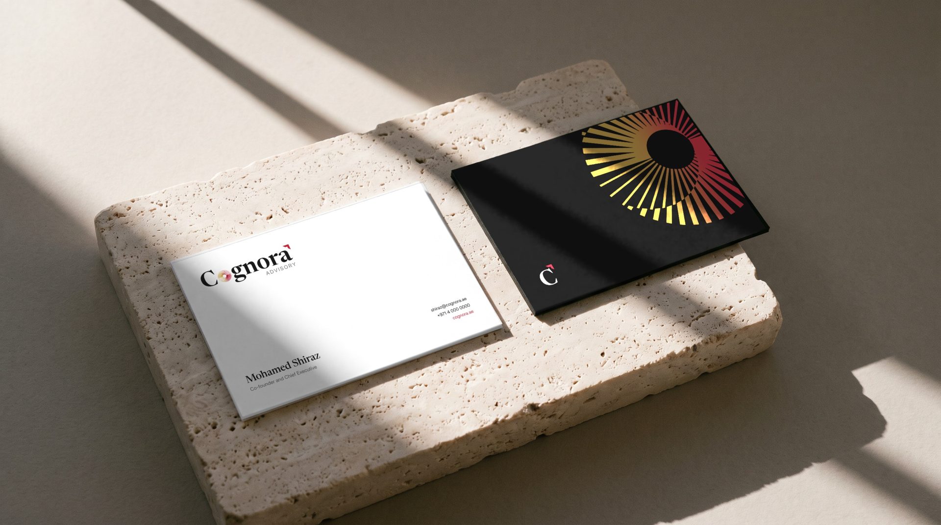
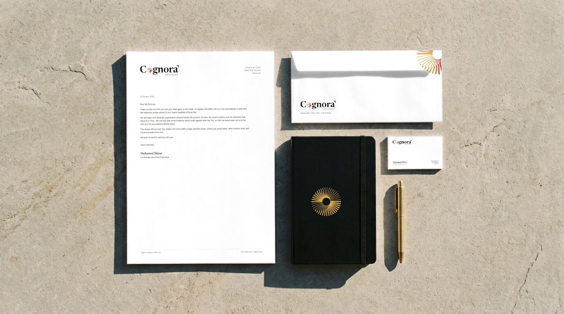
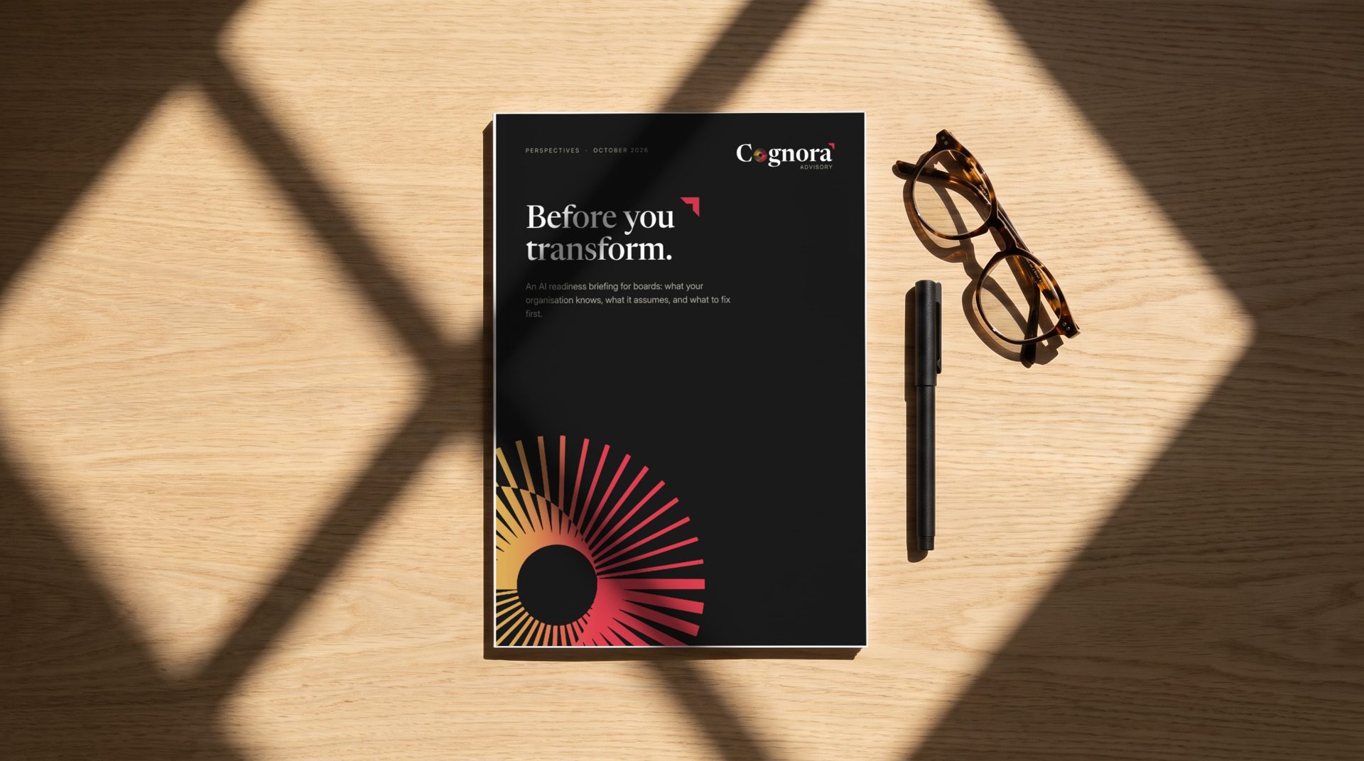
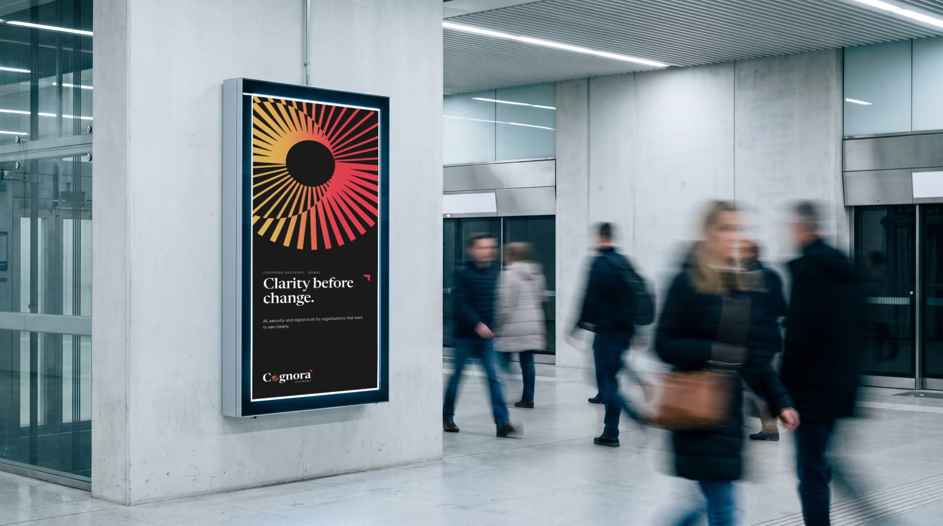
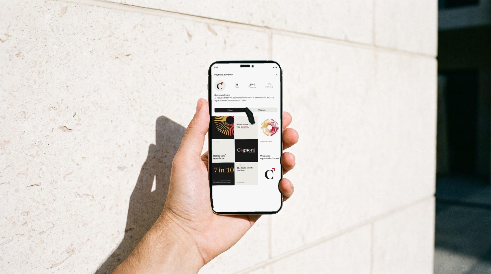
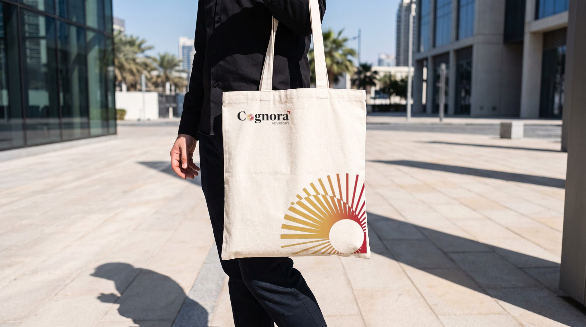
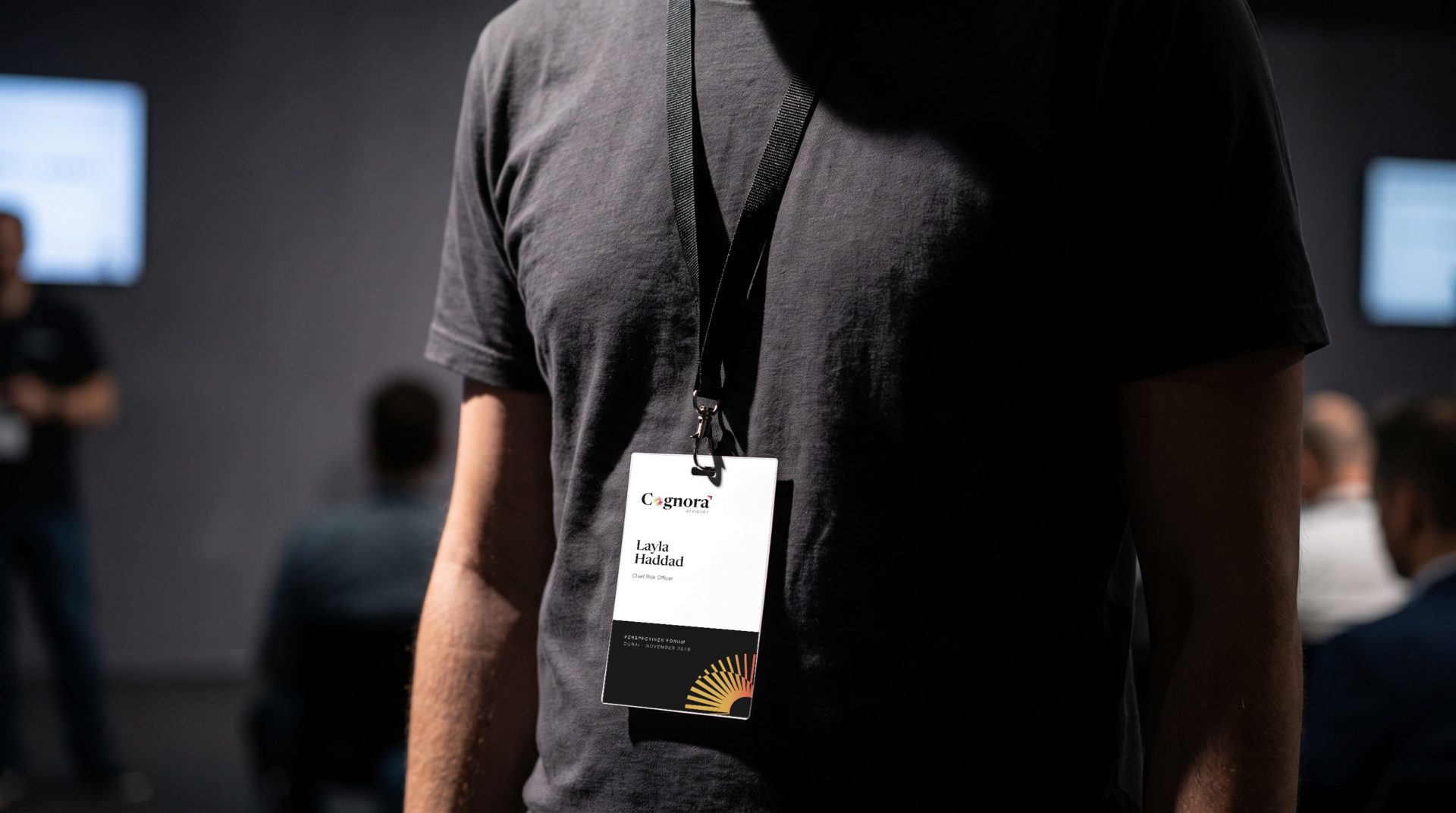
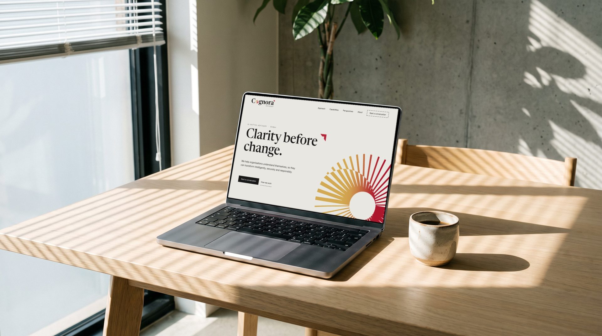
Contact details on stationery and figures in posts are placeholders until confirmed.
10 In good company
Among the firms it will be compared with.
Cognora will be read beside these names in tenders, on panels and in a client’s inbox. Placed among thirty-five of them, it holds its own and is still unmistakably itself.






























Logos shown for comparison only. They belong to their respective owners.
11 Next
Three confirmations, then we build.
- 01Confirm where the symbol is used. Our recommendation: small spaces only, with the full logo everywhere else.
- 02Confirm the details for stationery: names, titles, phone numbers and the domain.
- 03Approve print values for garnet and gold on a press proof.
With these in hand we prepare the master files and move into collaterals and the website.
See the creative direction
Prepared by Curio:City for Cognora Advisory. October 2026. Confidential, for client review.