

Cognora Advisory · Brand identity
Creative directionHow the identity is used
Intelligence,
observing intelligence.
01 The idea, shown
Three moves, used everywhere.
Intelligence, observing intelligence. The idea is never written out on a page. It is shown, every time, by the same three moves.

Two levels in one mark
Outer rays and inner rays, one inside the other. The organisation, and the organisation looking at itself.

A vantage point
The bracket marks the one thing worth looking at. One per page, always at the top-right corner of a headline or a figure.
think.
Space around the thought
Few words, large type, generous margins. The aperture sits large and cropped, or on its own.
02 Composition
Eight rules for every layout.
- The aperture never shares space with text.Large and cropped off an edge, or alone in a clear field.
- One bracket per piece.It marks the top-right corner of the headline or key figure, never a paragraph.
- Garnet marks one thing.A word, a link, a bracket. If everything is garnet, nothing is.
- Emphasis is never colour alone.A garnet word is also underlined, so it reads in greyscale and for everyone.
- White, Mist or Ink grounds.Never garnet, gold or a busy photograph behind the logo or text.
- Gold stays in the graphics.In the aperture, and as large figures on Ink. Never as body text.
- The symbol for small spaces.Profile pictures, browser tabs, app icons, the corner of a post. The full logo everywhere else.
- Nothing is redrawn.The logo, the symbol and the aperture come from the master files only.
03 Type in use
Newsreader to speak, Inter to explain.
Newsreader carries headlines, quotes and figures, in Medium, set large and close. Inter carries everything else, in Regular and Medium only, with open spacing for labels in capitals.
04 Imagery
Real people, one warm light.
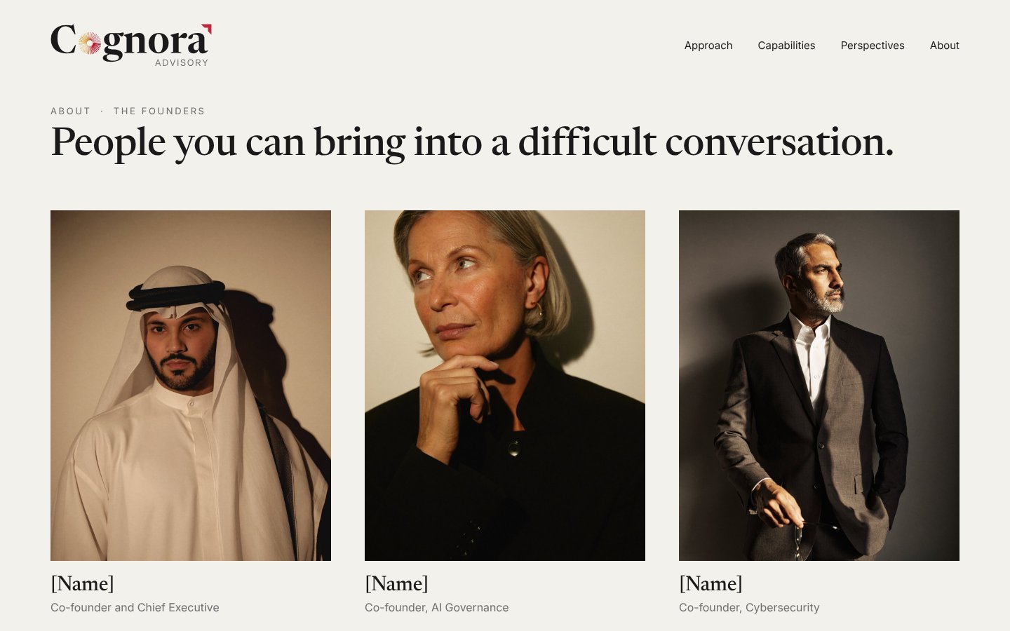
Portraits of the people who give the advice. One warm key light, deep shadow, a plain wall. People dressed as they are, looking as if they are listening.


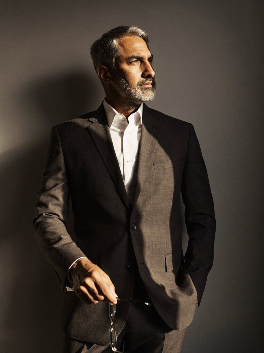
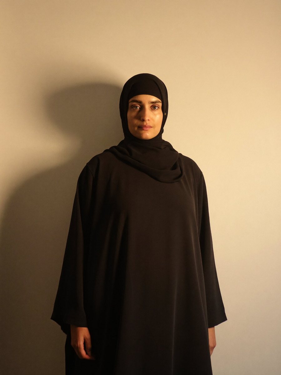
Style references made for this page, not the Cognora team. They are replaced by the founders’ own portraits, shot to this brief.
Never
- Hooded hackers
- Padlocks and shields
- Binary and code rain
- Neural networks and brains
- Robotic hands
- Purple or blue AI gradients
- Cyberpunk cities
- Server rooms
- Handshakes and stock meetings
05 Website
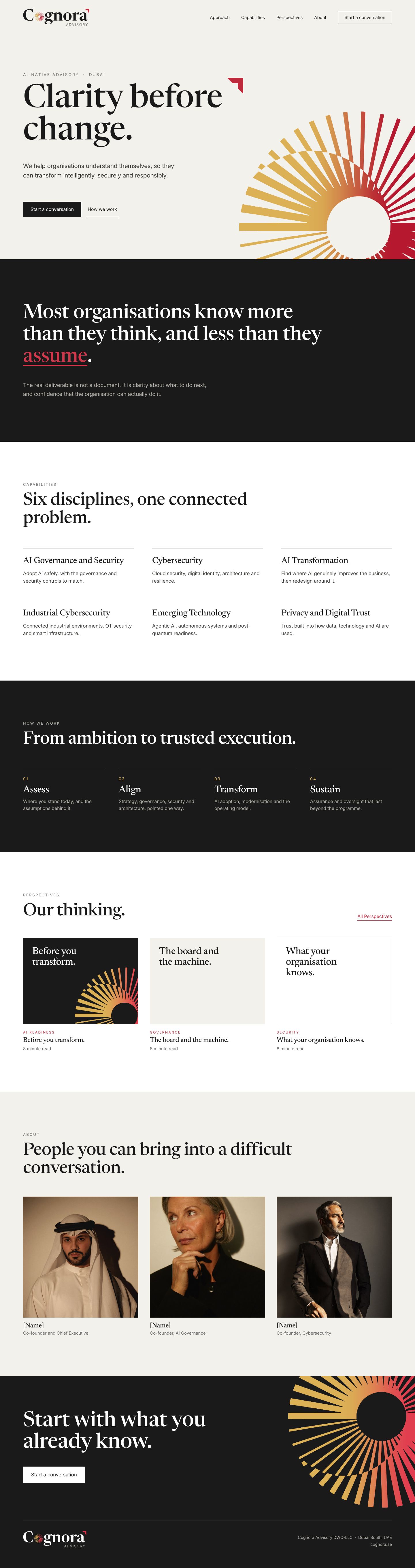
Mist to arrive, White to read.
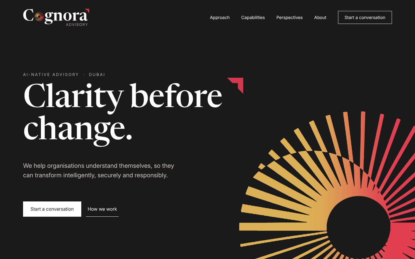
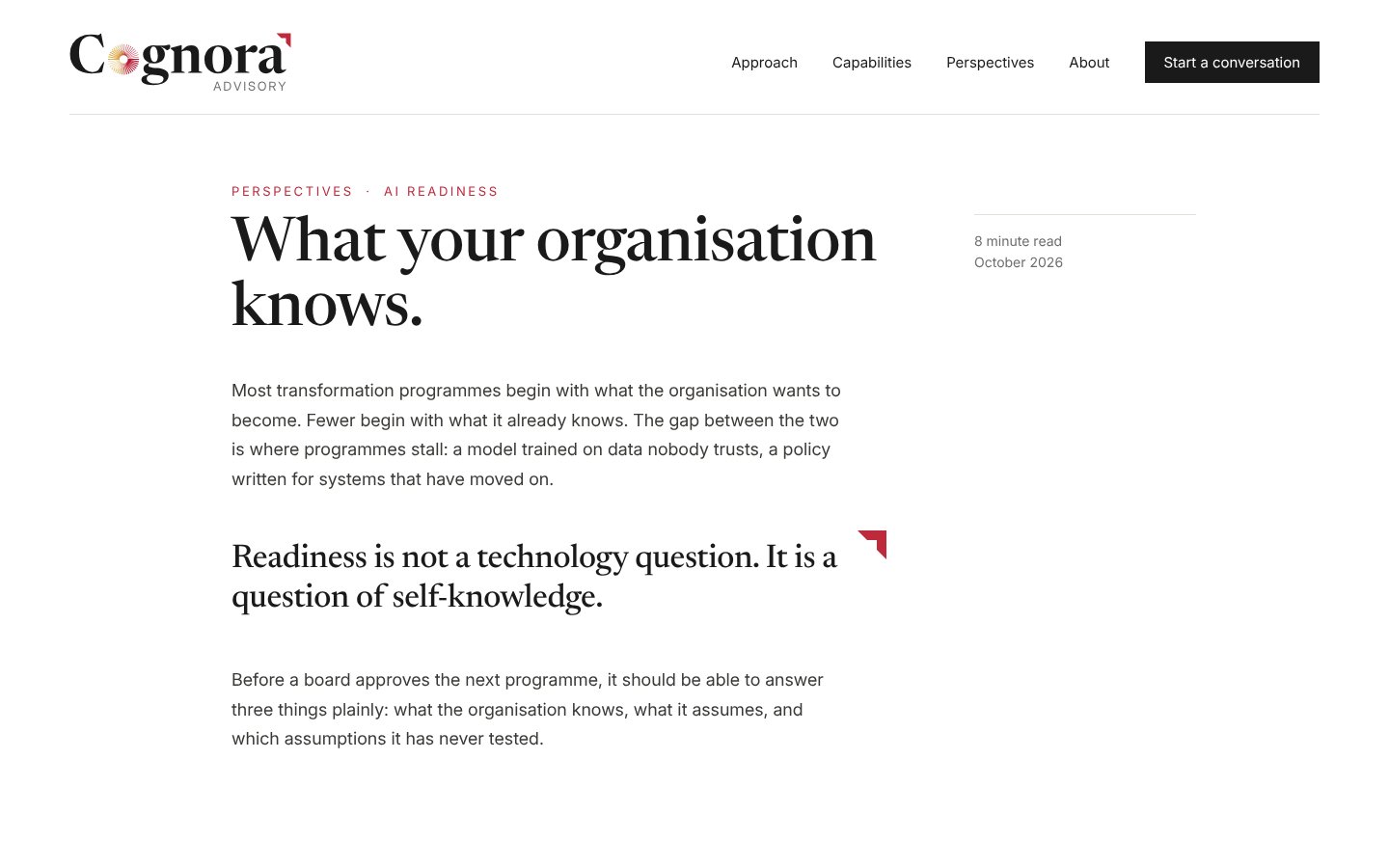
The aperture opens the homepage, cropped off the edge. Ink bands carry the statements and the method; White carries reading. Inside an article, the bracket marks the one line that matters.
On Ink
The same opening on an Ink ground, for evenings, events and a darker first impression. The garnet steps up so the bracket and the sweep keep their weight.
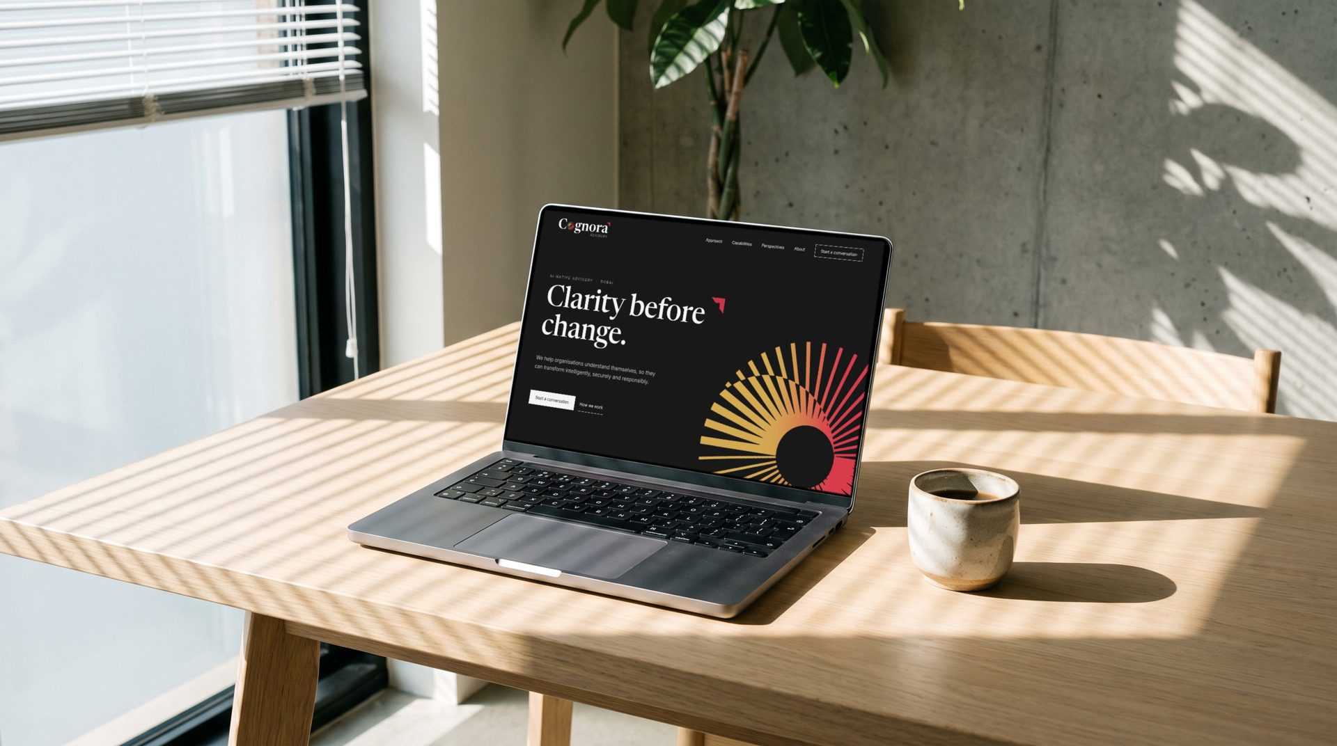
Inside the site
07 Print
Stationery and reports.
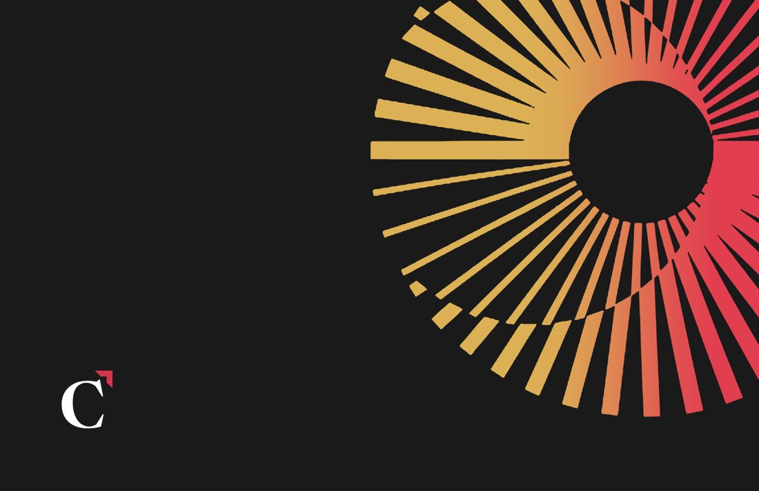
White fronts carry the logo and the facts. Ink backs and covers carry the aperture.
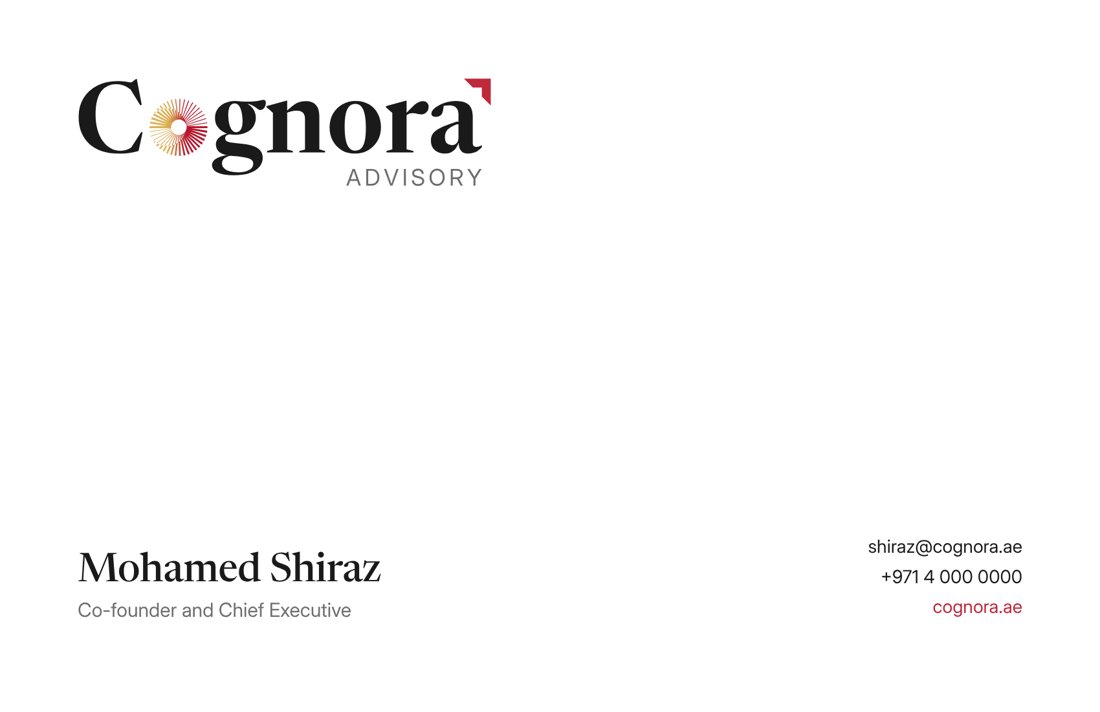
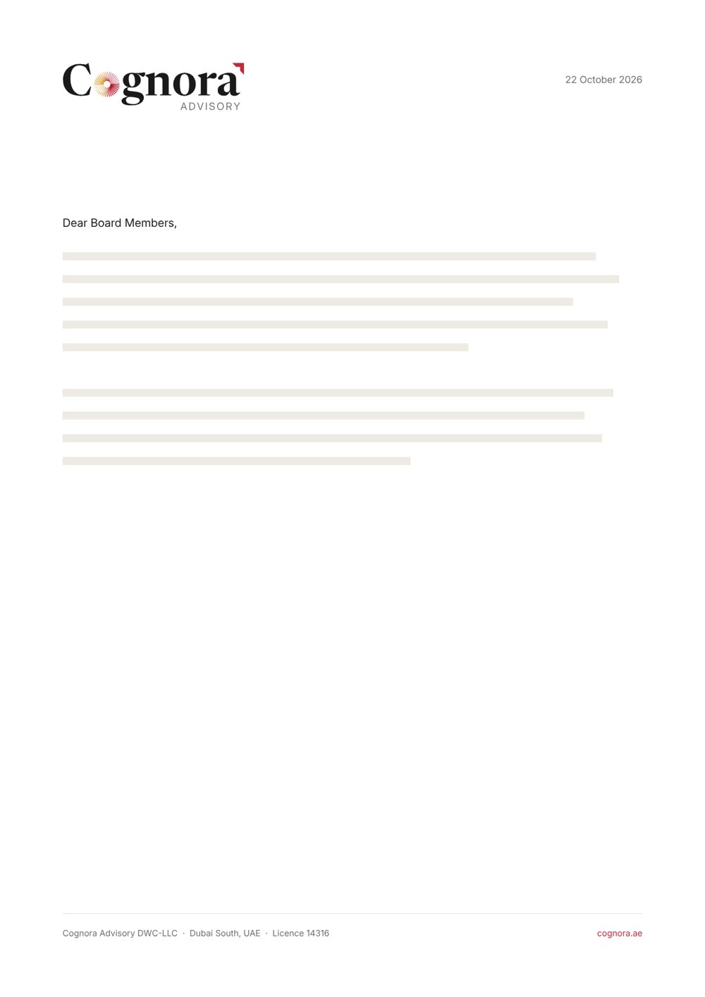
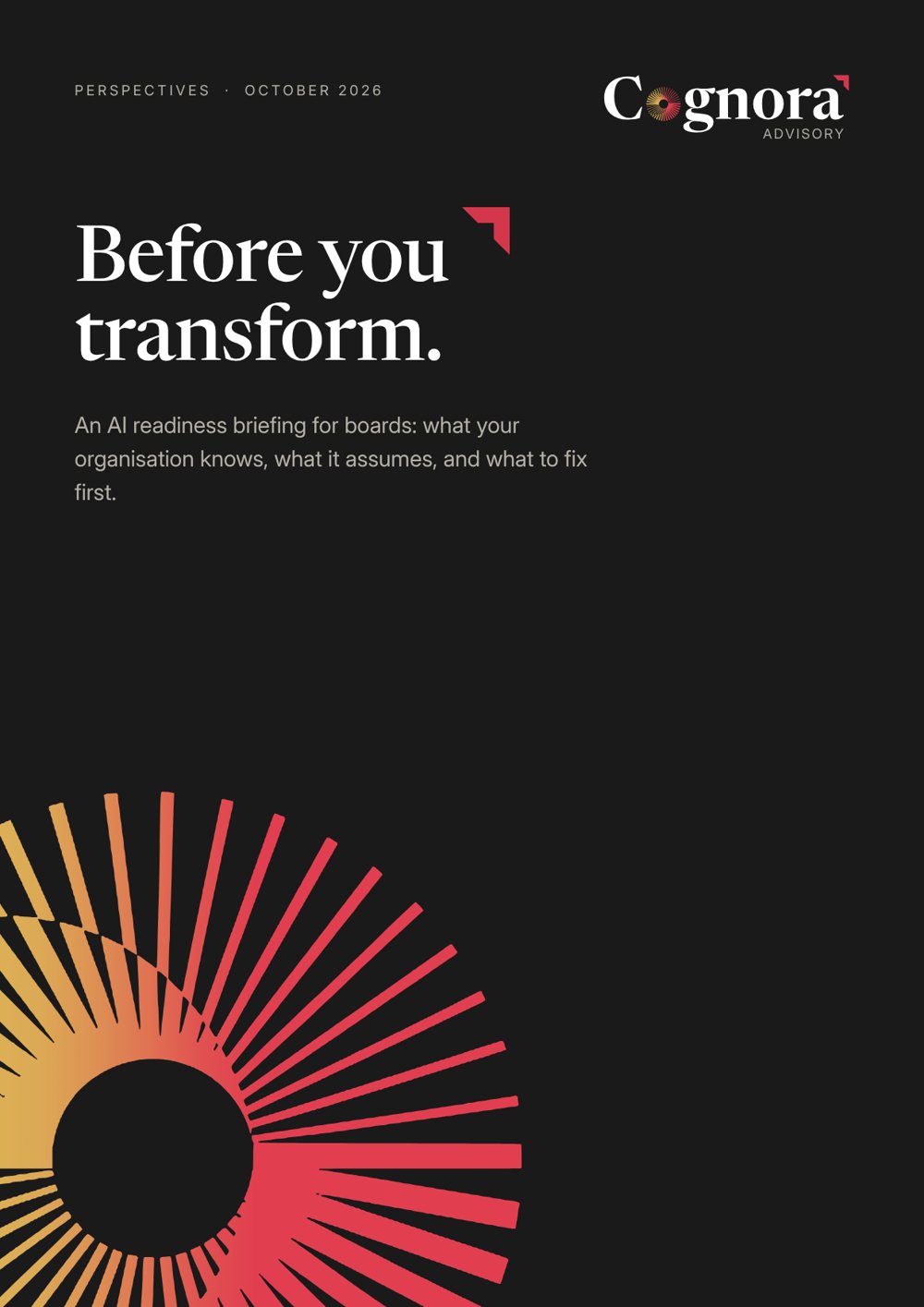
Domain, phone numbers and names are placeholders until confirmed.
08 Next
From direction to templates.
- 01Review the direction and the applications, and mark anything to change.
- 02Book the founders’ portrait session against the imagery brief.
- 03Confirm names, titles, phone numbers and the domain for stationery.
With these in hand we build the working templates for social, stationery and reports, and carry the system into the website.
Back to the identity
Prepared by Curio:City for Cognora Advisory. October 2026. Confidential, for client review.
06 Social
LinkedIn first, Instagram second.
Each kind of post has its own ground, so the feed reads as one system: Mist for voices and events, Ink for data, White for Perspectives. The symbol is the profile picture.
On the platforms
How the page and the posts read where people actually meet them.
Interfaces are simplified. Figures and names in these posts are placeholders for layout only.